Once again, hello my friends! Today, we’ll be discussing three basic principles of photography that can help enhance any picture to look more than a selfie or something you’d post on Instagram. These principles are: the Rule of Thirds, Leading Lines, and finally, Depth of Field. I will show you professional pictures that demonstrate these principles, while also taking pictures of my own in an attempt to replicate the same principles with my iPhone. That being said, please, don’t expect much out of mine. The pictures used at first were taken by various photographers from the National Geographic magazine company.
Rule of Thirds

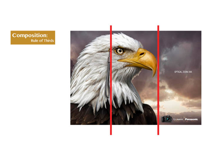
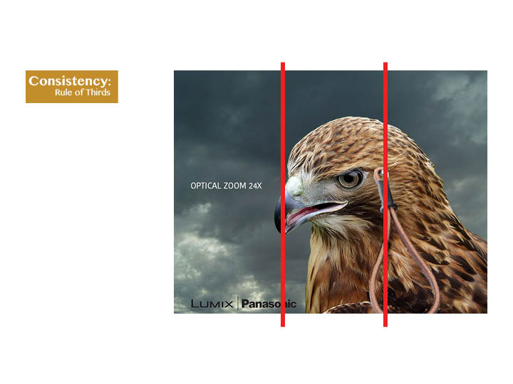
This picture, taken by Jimmy Chin for the National Geographic (seen here: http://proof.nationalgeographic.com/2014/02/05/photo-of-the-day-best-of-january/), demonstrates the Rule of Thirds. Now, the Rule of Thirds can be done in two ways yet both require one to visualize lines that segment a picture into thirds, as show below.

Simply put, the Rule of Thirds is where the focus is on the intersecting points of the “thirds lines”, or it is running parallel with either horizontal line. In this particular picture, while the climber is not directly over any of the intersecting points, I believe this still an example of the Rule of Thirds because his foot is nearly touching one and his hands are over a second—seeing this, I can’t help but feel drawn into this image of the solitary climber because of where his hands and feet are in proportion to him and the rest of the photo.
Now, for my attempt.


Again, I don’t pretend to be a photographer; however, I did want to emphasize the words “Holiness to the Lord, the House of the Lord”. Though simple, I think this still captures the idea because of the placement of the top row of the inscription right where the horizontal top row runs.
Leading Lines

(Link to original: http://www.nationalgeographic.com/apps/, taken from National Geographic through Google Images)
Leading Lines are a fun phenomena that photographs can create—essentially, it’s as the name suggests, lines in the photo that point towards a particular location or item. This guides the eye of the viewer to something or someone.
In the case below, a picture of the Eiffel Tower taken from the National Geographic website, the leading lines can be found in the overall shape of the structure: that of an arrow going heavenward. Indeed, and especially at this angle, is this true for photos depicting tall buildings of any kind and particularly those with hard lines like the Eiffel Tower.

Now for my attempt:


I tried to create this same idea, using an elegant building with hard edges and plenty of vertical lines that suggest upward ascent. For some, this may show religious significance (like that of the temple) or it merely is a symbol for progression and achieve (like that of the Eiffel Tower). No matter the reason, however, the Leading Lines are always meant to direct our eyes and thoughts towards a particular subject that the photographer wishes for us to mull over.
Depth of Field

I didn’t want to enlarge Shahnewaz Karim’s photo any more than I had to, because the larger I attempted to make it the blurrier it became. With Depth of Field, you have the foreground and background—objects that are clear and are emphasized and naturally the more important in the photos, and others that are blurry and are signified as less important. In this particular picture, it shows the principle of Depth of Field because of how stark the contrast is between the subject (the woman in the saffron robes is compared to the rest of the photo.
This is particularly noticeable between the woman in saffron and the woman on her left.

Now, this I felt was the hardest of the three principles to replicate. But I did give it a whirl.


As you can see, I somewhat reversed the idea of the foreground being in focus while the background being out of focus. It’s a bit hard to tell simply based on resolution, but in the original picture, the front four blades of grass are out of focus despite being in front of the vivid, popping, clear purple flowers.
Conclusion
This was an interesting project to embark on because it allowed me to be more conscientious of all the minute things that goes into making a good, quality picture. And, in reality, there are just a few simple principles that if followed can not only change your perspective of your pictures or that of others, but really the natural beauty of the world around us.